

Two original photos by myself were utilized as my bases:
♦ Click the picture to see the larger one!


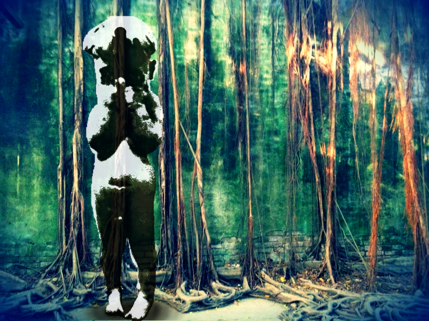
Firstly I attempted to cut the ‘boy’ out and integrated with the background by adjusting the saturation and applied filters.


After adding blue ‘Vignette’, I experienced two different ‘Adjustment’, Solarize and Cross Process. Both of results were effective for me whilst the right one seemed to fit in with the boy.
♦ Leave a comment if you like!


Enlarged the right one above.
Also changed the shadow underneath his feet by using Brush in 200 diameter and various opacities.
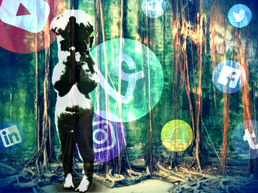
Put several social media icons in surroundings and changed the opacity in layer setting to create the bubble effect.
Icons source: “Social Media Icons” by Freepik is licensed under Flatiron Basic License
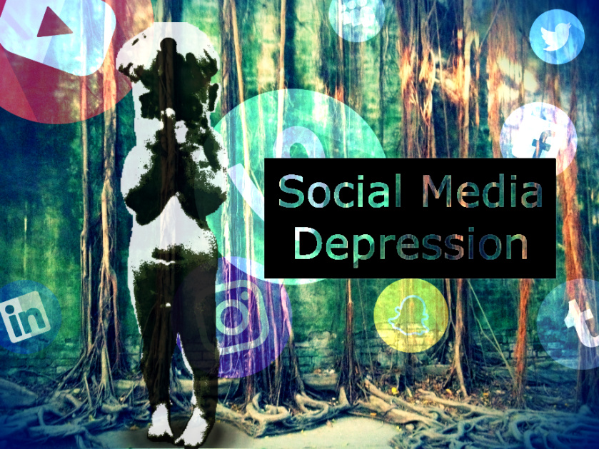
Added the text: Social Media Depression.
It took some time to create the hollow-out texts! Here is my tips for people who like to try:
One layer for the shape(mine is the black rectangle);
one layer for text(set a obvious color).
Rasterize the text layer,and then merge two layers. Use Wand Tool to select the whole black(in my case) part without text shape. Then click ‘add layer mask’ underneath the ‘Layer view’——>Done!
- #9, “Social Media Icons” by Freepik is licensed under Flatiron Basic License
Reflection:
As various social media became the main method of communication in the digital world nowadays, the young generation faced more complicated social problems like cyberbullying and there are reports showing that the usage of social media could cause the metal problems, social media depression (Facebook Depression might be more known for people).
I used the child as the symbol of the young generation and the icons like floating bubbles represent the ubiquitous social media in our world. The backdrop was full of trunks and reveals the connection between the land and lives.
The text was aligned center on the black square and designed in the hollow form and light shadow in order to emerge from the multicolored backdrop.
Experimented more:


In image #10, I tried ‘Aµù’ font to relate to the boy like child writing and placed on the bottom part instead of blocking the icons.
In image #11, I tried ‘Stencil’ font from Aishah’s comment, which was operated in Photoshop. Plus, the layer style was adjusted by opacity, size, range of ‘Outer Glow’ in Photoshop. This seemed to be more concrete for the whole picture.
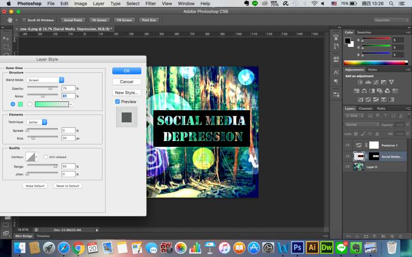
↓ In image #12, the Stencil font was also chosen while I applied the ‘Outer glow’ on this layer in Pixlr. This was slightly different from the previous one. Moreover, I took the advice from Aishah’s comment, enhancing the Facebook icon by lapping on the text square.
In image #13, I tried the ‘Ruotan’ font in bright color without black square.


Final Poster:

The foreground presents an extremely captivating colour scheme that draws my attention to the bubbled icons. However, I think the Facebook symbol has been faded in a little bit too much and would recommend increasing its opacity so that it is showcased clearer. The juxtaposition of the child in black and white to the surrounding environment conveys the message of youth isolation succinctly. I do believe the typography of the words ‘social media depression’ can be enhanced; perhaps using a Stencil Font would enhance the aesthetic. Lastly, it is also important to acknowledge any ethical issues you may face in the usage of icons as to not incur any liability.
LikeLike
This is a really good example of social media disconnection; it offers a crude reality since it is young people who are suffering from this isolation and are instead relying on social media as a means of escaping reality. I think both pictures work really well with the text- the message is defiantly there. The social media icons make it inclusive and alluring. The background colour is engaging and defines a false reality. The social media icons could have been maybe more opaque since they are a bit hard to see, and possibly the child could have been the central focus maybe with more vibrancy and opaqueness. Overall, I think this is a great digital image that really does work with the theme.
LikeLiked by 1 person